Edit: 12/1/12 An error on the Direct Object posters had been found and is corrected. Sorry for the inconvenience.
Grammar...the program we use presently, for schooling at home, spends a lot of time on GUM- grammar, usage, and mechanics. Yes, I'm pleased! I find that as the children get older, K12's curriculum includes application of Grammar, Usage and Mechanics in more subjects than just "Grammar". Another pro of the program. :-) Repetition! They really will not retain a lesson if they don't use it.
Grammar...the program we use presently, for schooling at home, spends a lot of time on GUM- grammar, usage, and mechanics. Yes, I'm pleased! I find that as the children get older, K12's curriculum includes application of Grammar, Usage and Mechanics in more subjects than just "Grammar". Another pro of the program. :-) Repetition! They really will not retain a lesson if they don't use it.
So, that being said, I have found that some parts of grammar has been difficult for the students to grasp. Particularily verbs. So, we spent last week's morning group lessons to work on some "Super Sentences". My hope would be that it would be short and sweet...the 1st morning morning took quite a bit longer than expected. Probably because we had to go through every component and refresh memories of what they meant. The remainder of the groups ended up much more "short and sweet". :-) So, recap...I have 1st-4th graders who are working on Grammar. Some of it is beyond the 1st grader, but he'll get what he can and it'll be a good foundation for him for when he formally works on the specific components of grammar. Presently he's worked on types of sentences, punctuation, common and proper nouns.
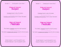
I created simple posters to go with every aspect they have learned in Grammar up to this date.
(I'm disgusted at the quality of the images here. My apologies ahead of time. At least it will give you an idea of what the posters look like. This has happened before I haven't found a solution yet...so any suggestions for me? I upload an image and it uploads just fine and dandy...clear, then I put it into the blog post and it turns blurry. I don't like having to take photos of laminated pages...never turn out well. :-) Either they are blurry, like above, because I didn't use flash, or I use flash and they are nice and clear except for the big glare in the center of the pictures. LOL I'm going to leave these pics up though, in case anyone has a suggestion for me. I have tried making sure they were high quality in Adobe...doesn't make a difference.)
(I'm disgusted at the quality of the images here. My apologies ahead of time. At least it will give you an idea of what the posters look like. This has happened before I haven't found a solution yet...so any suggestions for me? I upload an image and it uploads just fine and dandy...clear, then I put it into the blog post and it turns blurry. I don't like having to take photos of laminated pages...never turn out well. :-) Either they are blurry, like above, because I didn't use flash, or I use flash and they are nice and clear except for the big glare in the center of the pictures. LOL I'm going to leave these pics up though, in case anyone has a suggestion for me. I have tried making sure they were high quality in Adobe...doesn't make a difference.)
* Complete Sentences-including subject/predicate
.pdf distorted slightly, as usual. Prints fine though. Not quite sure why this one changed the color of the left poster. It's still correct in the original file??? If someone has a suggestion for me on how to change this, I'll try it!
* 4 Types of Sentences (using 1st grade - 4th grade language)/ Punctuation
* Nouns (types of nouns, simple/compound, singular/plural, direct objects)
* Verbs (action, being, helping verbs, 4 principals parts, irregular)
We'll use these as a reference throughout the year. Makes it easier than trying to find the correct portion of the student book or teacher guide when we need a quick reference for our activities.
Morning Group:
I wrote words to create a sentence, out of order, without capital letters and punctuation, on the dry erase board . They created their own sentence out of the words and then we went through the posters, touching on each of the topics. Is it a complete sentence? What makes it a complete sentence?, etc
Feel free to download the posters here if they would be helpful to you. :-) I plan on creating more as we go along. Pronouns are our next thing on the agenda. Perhaps I'll bind them or put them on a ring, I forsee them being very useful!


These look really nice. I think the pictures look fine...maybe it's just because they're small. If I click on them, they look clear to me. Here's another resource I found online from Teach Preschool. Maybe you saw it too: http://apps.fellowes.com/microsite/ideacenter/ideas-for-school.html
ReplyDeleteI don't know how you're keeping up with all this. I'm sure you put a ton of time into it and the results will prove it! You're brave & ambitious!
Neat site! Thanks. Been awhile since I've been on TeachPreschool. Yes, I guess if you click on them they aren't so bad but I don't like the "presentation" :-P Oh well.
ReplyDeletefurnance? or furnace?
ReplyDelete<3